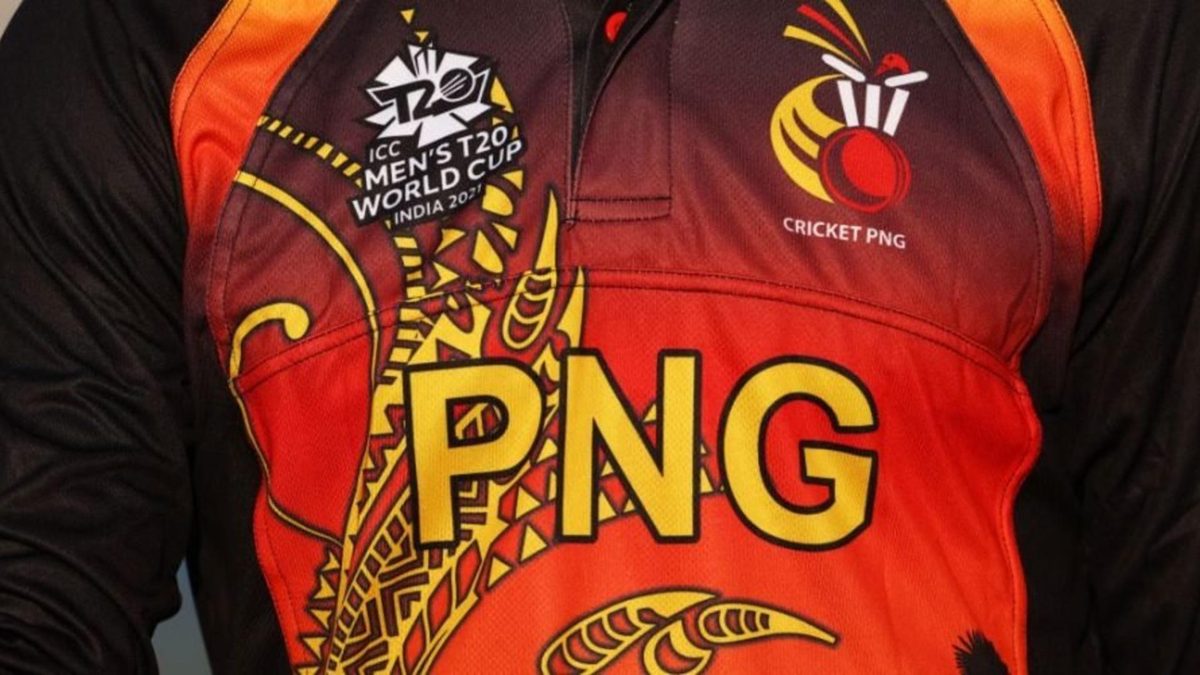
Here’s a ranking of each jersey at the T20 World Cup 2021, ordering the kits of each of the 16 teams on the basis of our rudimentary design sense.
Sign up to bet365 to be entered into a draw for the chance to win a Wisden Hoodie, terms and conditions apply, more information here. 18+ begambleaware.org
The T20 World Cup is back, bringing along new avatars of (arguably) the most exciting aspect of the game – cricket kits. The official jersey of each of the 16 teams at the T20 World Cup 2021 have been revealed; while most of them are new-look, a few of retained their old shades ahead of the competition.
Here’s the full list:
T20 World Cup 2021 jersey list
#16 Bangladesh
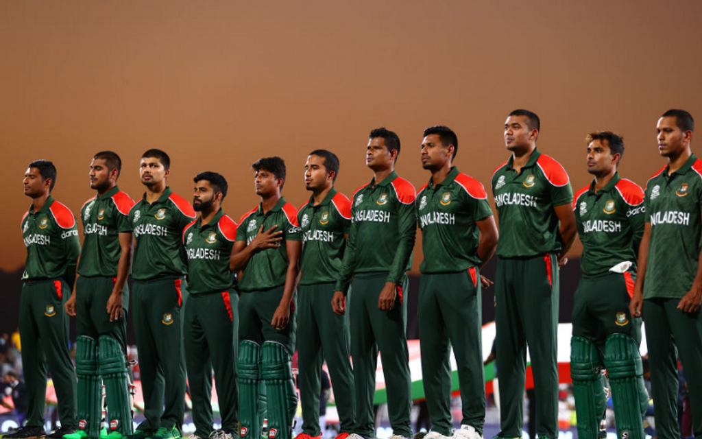
The Tigers’ green & red jersey feels like it has been the same for ages, with red sleeves or its equivalent going around the green torso. This time, the red patch has been kept to the shoulders, but in a competition that has colourful hues and funky patterns, Bangladesh’s usual colours make it a tad unimaginative. There’s a red version too, but that’s even more jarring to the eye.
# 15 Ireland
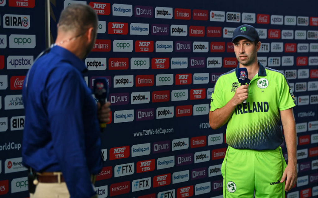
Nothing fundamentally wrong with this one, just that the neon green colour seems to have lost a bit of its novelty over the years. There’s a halftone gradient of blue creeping up from below, but it doesn’t really tone down the contrast of the overwhelming green in there. The other jersey has its colours flipped, but even the dominant blue doesn’t save the overall design.
#14 Oman
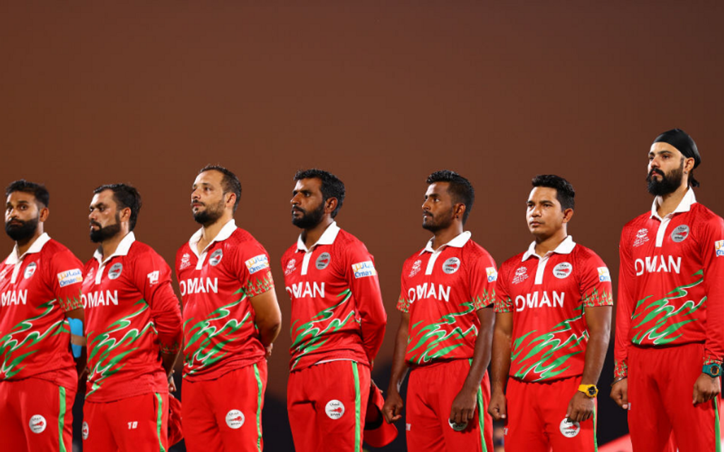
The red, white and green combination has been retained from the 2016 T20 World Cup, just that there seems to be a lot of red this time. A lighter shade could have probably done the trick?
#13 South Africa
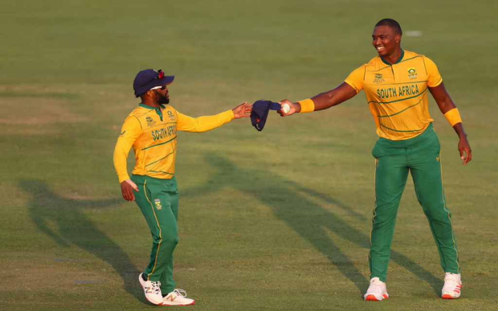
It’s been a while since the cricket team’s colours matched those of the Springboks, with lighter hues taking over as the years progressed. They’ve stuck to a yellow top, with the kit looking more Australian than South African, although the greener version looks a bit prettier, especially with the pattern at the bottom, and on the collar.
#12 Afghanistan
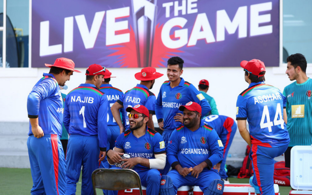
While the base colour is nice, and has symbolised Afghanistan cricket over the years, it probably pales a tad in comparison to some of the other kits in the competition. The red borders might need an upgrade, but that’s all for later, for we love to just see the Afghanistan cricketers on the field right now.
#11 Australia
Why Australia will wear two different kits at this year's #T20WorldCup, the first time the men's team has been forced to wear an alternate | @Dave_Middleton https://t.co/yLnKL4X8zv pic.twitter.com/fGjVVAOXVD
— cricket.com.au (@cricketcomau) October 19, 2021
What’s wrong with it, you may ask. Same old, I’d say. The yellow and green kit is pretty similar to the one at the 2019 World Cup, and the gold and black kit matches that of the women’s team at the 2020 T20 World Cup. For the five-time 50-over champions looking to claim their first T20 title, and wearing an alternate kit for the first time, a bit of innovation would have been nice to see.
#10 West Indies
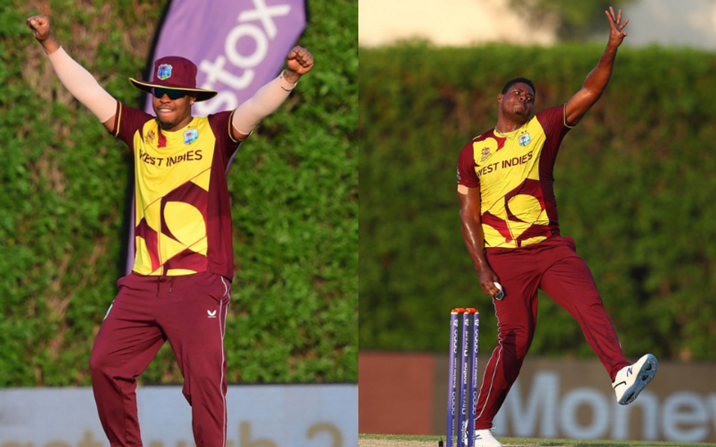
The defending champions walk into the tournament with an array of T20 veterans in their rank, who’ve been accustomed to wearing the same shade of maroon and yellow for years. Their latest T20I outfit has a diagonal pattern in the bottom half, adding a much-needed element to their usual, plain colours.
#9 England
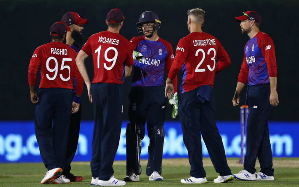
The team with probably the most kit changes of anyone at the tournament, England’s latest offering comes with translucent shades of blue splashed over the trademark red. The design ends abruptly though, and the dark blue trousers don’t really add much.
#8 Netherlands
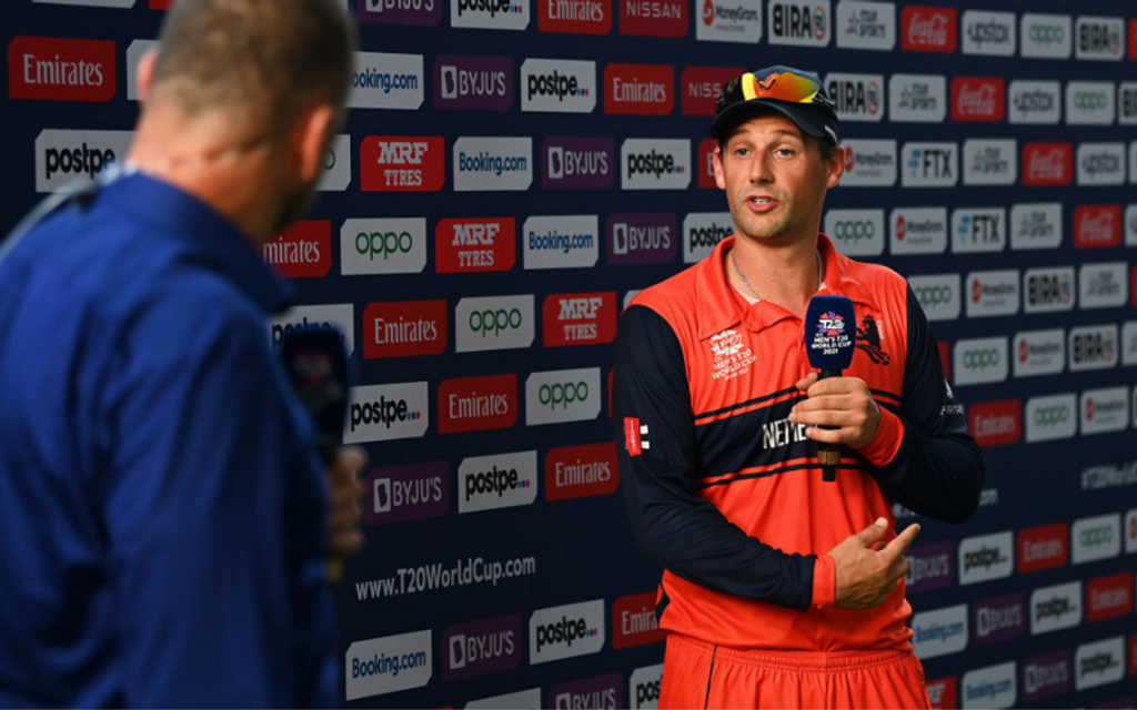
Pieter Seeelaar’s men have gone with a simple design, proudly brandishing a base colour that symbolises the country. The strip of dark blue adds a bit of classy depth on the chest that evokes the ’96 World Cup kits, as do the sleeves. Not quite there in the ‘best’ league though.
#7 Pakistan
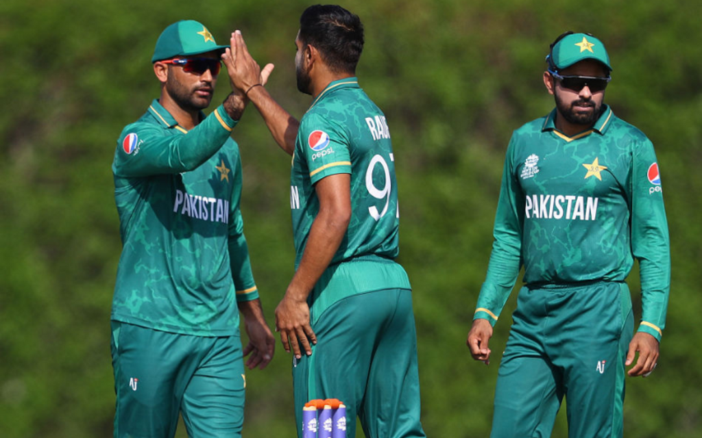
It’s all dark green for Pakistan this time, with barely any hint of yellow, and a nice, lightning shade adding a bit of fluidity to the overall design. A good change from the usual light-dark green template for sure.
#6 India
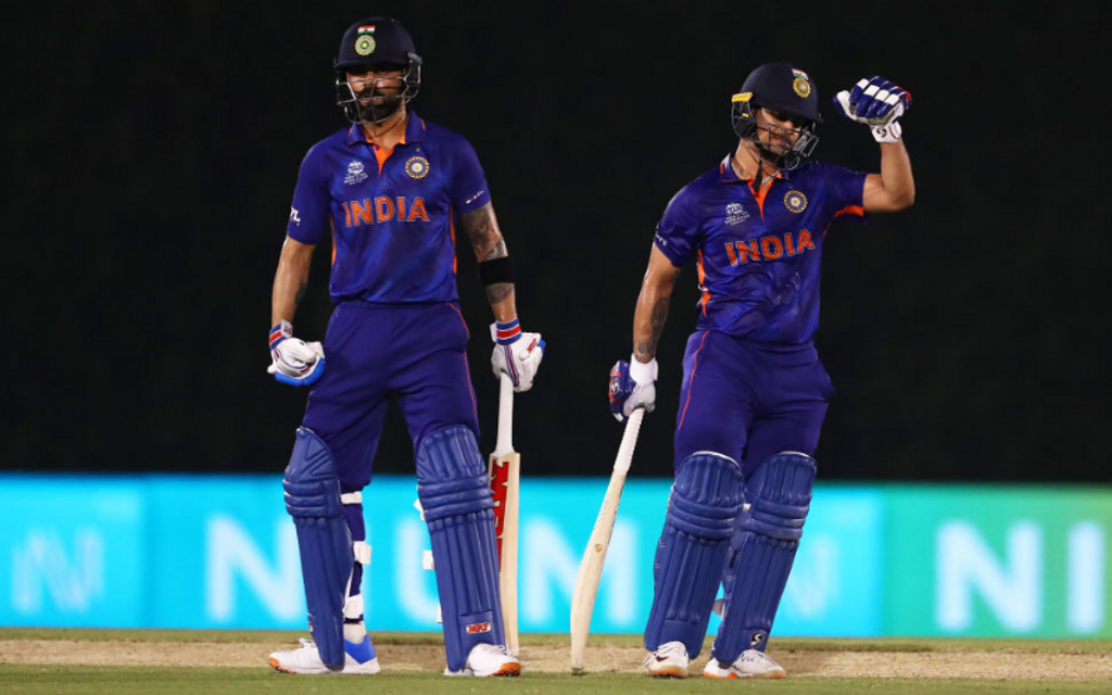
After trying out their retro kit for a year, India went with a new shade of blue, adding alternating soundwaves across the length of the jersey, which, according to the creators, is “inspired by the billion cheers of fans”. While some love the new tinge of blue, others aren’t as convinced.
#5 Sri Lanka
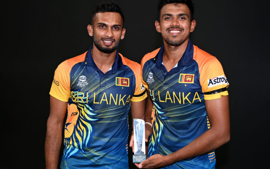
The overall colour scheme of the jersey hasn’t changed much, but there’s a welcome difference to the torso, with half-a-lion’s face emanating sunshine from one side. It’s new, it’s different, it’s nice – the alternate kit’s colour scheme is even better.
#4 New Zealand
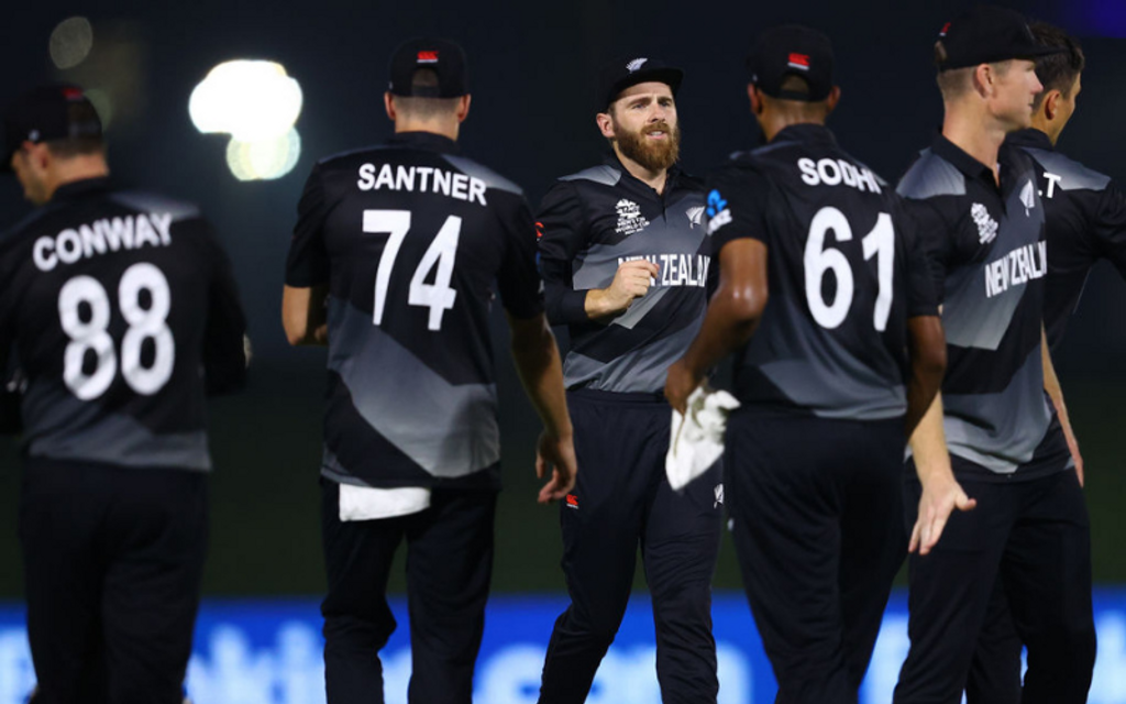
The Black Caps’ kits have always been classy, but they somehow keep getting better. The newest one has a nice gradient of grey running around, adding good depth to the customary black. Their teal alternate kit has caught the eye on social media. Could be the kit that wins them their second ICC title this year?
#3 Namibia
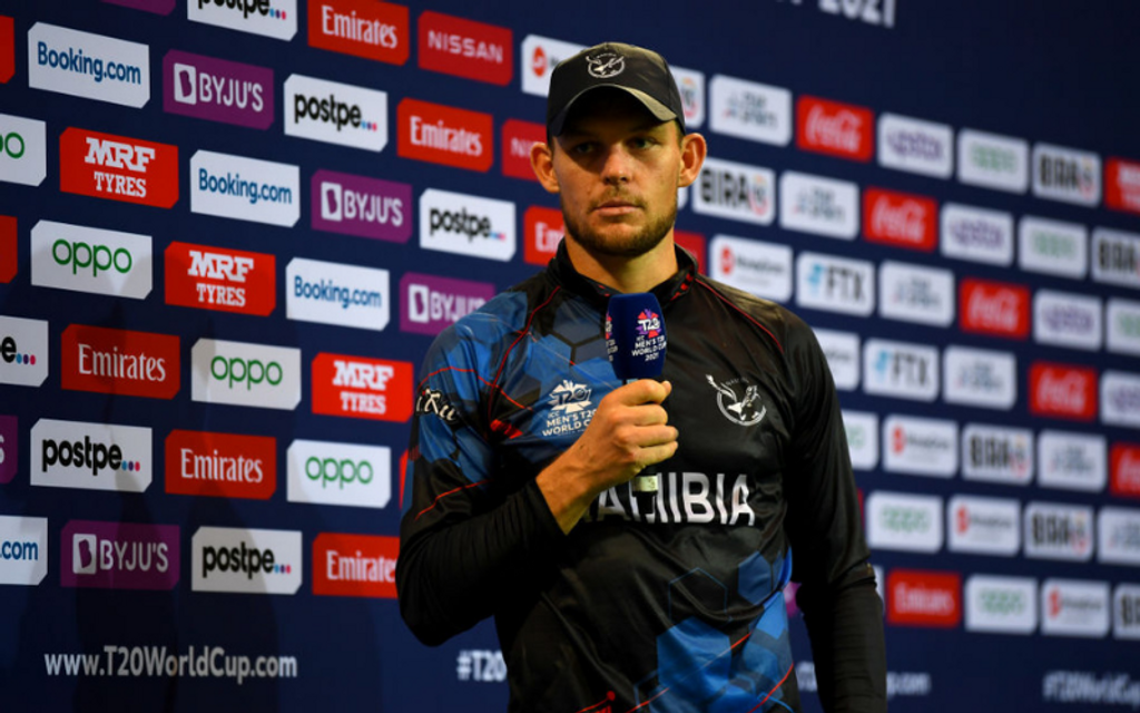
Namibia’s colours are refreshingly good, matching the Kiwis in terms of style, but going a step ahead with the beautiful contrast that the blue hexagons provide. There’s a hint of red peeping out too – what’s not to like, really?
# 2 Papua New Guinea
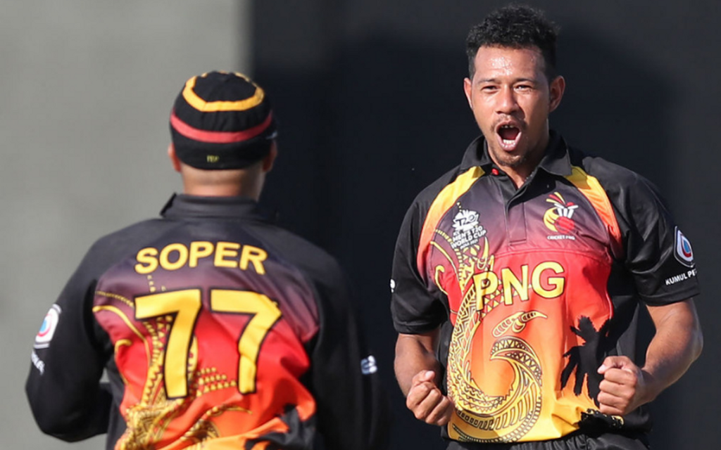
PNG created waves with their uniquely designed kits in the 2019 Qualifier, and have gone a step further with more orange on their torso this time. Bonus point to the Barramundis for the headgear. There’s also a dragon running along the length of the jersey – what can really beat that?
#1 Scotland
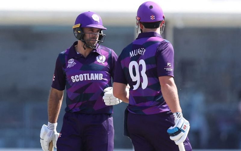
A 12-year-old’s design, if you ask. Scotland chose their kit after a public competition, with the winner, in her pre-teens, creating those elegant purple shades. The dark and light hues complement each other really well: just like 12-year-old Rebecca – this kit, too, is a winner.


