
Best and Worst: World Cup kits – From England’s 2019 retro to India’s opera of sad canaries
 by Phil Walker
@Phil_Wisden 4 minute read
All kits are garish, but some kits are more garish than others, writes Phil Walker as he lists down the best and worst world-cup kits in Issue 21 of the Wisden Cricket Monthly.
THE BEST
Australia, 2007
Blame adidas. They swan in, get hold of the most successful cricket team in history, look them up and down, and say, “Guys, what you need is a zip. Hmm, and while we’re at it, let’s lose the collar.” A third title in three was nailed on before a ball was bowled.
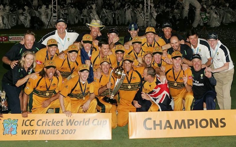
The Australian team celebrates its third successive World Cup triumph
Scotland, 2015
Oh baby. Perhaps the most elegant kit of them all. Tartan touches for the folks back home, layered with ocean blues and dimly-lit mauves, it’s a Miles Davis long-player of a cricket kit. It perfectly encapsulates the struggle. Underfunded, perpetually unlucky and on a final run in the big show before being shunned for the next, Scotland’s cricketers nonetheless confirmed what all true cricket fans know in their heart: Style is all.
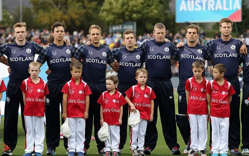
Scotland made its third World Cup appearance in the 2015 edition in Australia and New Zealand
Netherlands, 2007
Anyone who can’t get with deep orange offset with dark blue swirls is in the wrong sport.
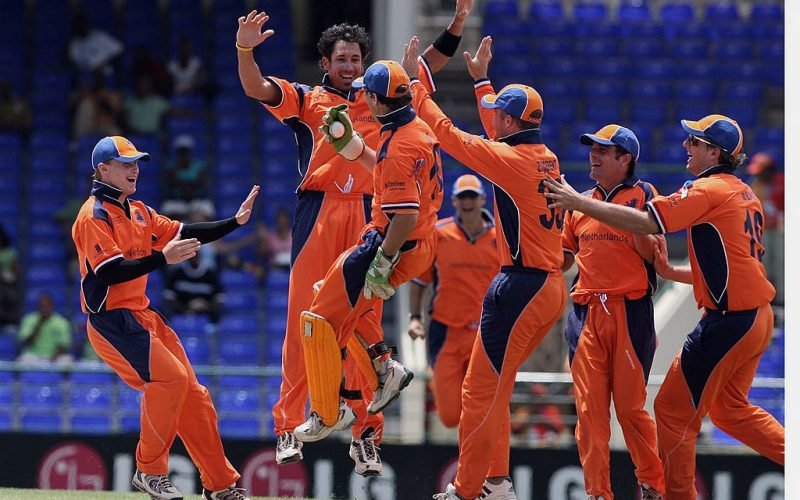
A bit different!
New Zealand, 1992
This is a personal choice. One could have selected any of the nine identikit dream-coats on offer. I just like the New Zealand one best. Grey is the old black, and so much more them. The uniform blackness of their modern-day kits seems to me something of a fib. Black means business, whereas grey is the colour of compromise, of subtlety and nuance. Grey is the colour of New Zealand cricket. And those iconic colour strips across the shoulder? Works beautifully with a pale palette. Oh, and Martin Crowe.
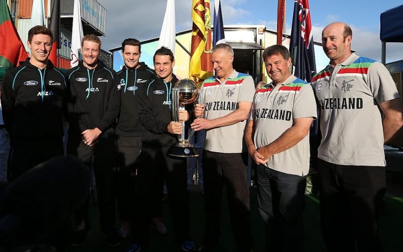
Matt Henry, Martin Guptill, Mitchell McClenaghan and Nathan McCullum pose with with New Zealand’s 1992 WC team members Gavin Larsen, Rod Latham and Chris Harris at Wynyard Wharf in Auckland, 2014
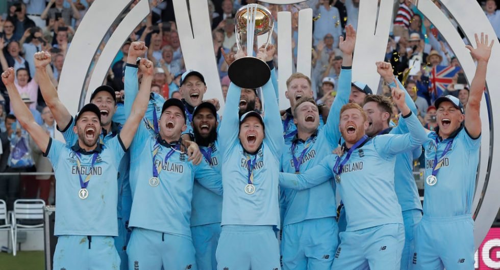
England, 2019
It’s coming home, consciously retro styling is coming home.
From walking in a World Cup semi-final to deliberately bowling a no ball to deprive a batsman of a century.https://t.co/QsJxObvFfG
— Wisden (@WisdenCricket) June 3, 2020
THE WORST
India, 1999
It’s that pattern on the front. Like an opera of sad canaries shuffling down an escalator. Which rather summed up India’s campaign that year.
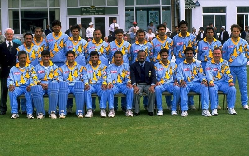
Like ‘an opera of sad canaries’?
England, 1996
Sure, there are connotations. Is the shirt really as bad as the memories it evokes? Perhaps, perhaps not. But this was the era when nothing fitted. Not least those trousers. When the cricket is off-colour and out of kilter, it bleeds into the shirt itself. This one had a kind of customised vibe to it: the lettering of the names on the back were huge, with the ironed- on England badge incongruously proud upon the breast. A shirt forever associated with Neil Smith and vomit.
Australia, 2003
Is it stars on the front of that abomination, or bullet holes on a Most Wanted poster? Unnecessary.
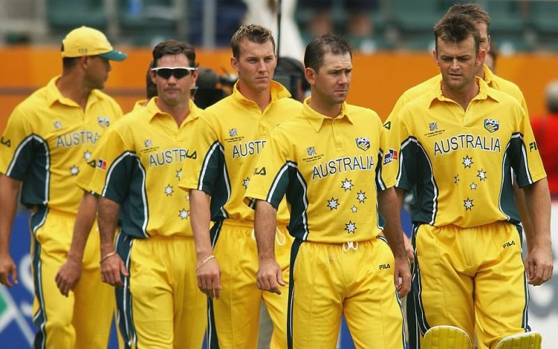
The Aussies enjoyed an unbeaten run at the 2003 World Cup
Zimbabwe, 1999
It’s the vast white diamond where the gut should be. It’s the yellow and white hoops either side of the only redeeming feature – the Zimbabwe Bird, given plenty of space there, perhaps more than strictly necessary. It’s the ill-fitting bagginess around the shoulder and the off-red colouring. It’s the overwhelming sense of having walked into a Brick Lane hipster flash sale. And not in a good way.
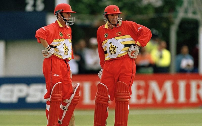
The Zimbabwe Bird on the T-shirt – more noticeable than the Flower brothers?
First published in Issue 21 of Wisden Cricket Monthly